

Personal Branding
Task: Develop a personal design ecosystem that emulates a unique identity
Roles: RESEARCH, LOGO DESIGN, BRAND DEVELOPMENT, ILLUSTRATOR, TYPOGRAPHY, CONTENT CREATOR
Programs Used: ILLUSTRATOR & PHOTOSHOP


Project Details
-
Vision Statement: “Innovative designs tailored just for you.” Communicating the ability to create unique and imaginative designs customizable to any potential client.
-
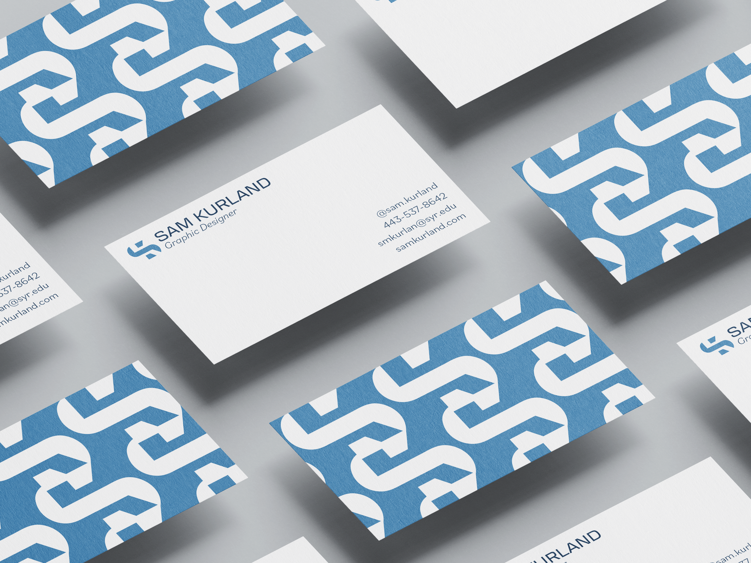
Utilizing the initials “SK,” the “K” is incorporated into the negative space of the S while maintaining a unique geometric design.
-
The wordmark uses the typeface Transducer VF - Regular, and the supplemental text, is set in Bilo: light, bold, and italic. Transducer VF is crisp and cohesive with the icon, and Bilo is clean and readable.
-
The primary colors are dusty navy blue [#2b4762], baby blue [#9dc7e0], and white. The baby blue is calming and approachable and looks great with the bold patterns used in the branding. The navy is for text and copy as it pops on the crisp white, enhances readability, complements the baby blue, and is softer than black. A muted green color is placed intentionally as an accent color in some of my branding materials to create more interest and depth.
-
I encountered many challenges in this project. For one, as this work is for my personal brand, I wanted to ensure it had longevity. I would be beyond happy with it as I would be using it to market myself and my image. Therefore, I ended up totally redesigning my brand multiple times. My first major challenge was creating the logo. I began with many concepts; however, I didn't feel that any of them had a cool graphic visual interest that embodied me as a designer. With many tweaks, concepts, and revisions, I finally landed on my final logo, which I feel emulates me as a designer. Although I am thrilled with the final result, the process was rocky, long, and frustrating. My second major challenge was finding that balance between visual interest and playfulness with crisp, clean stylization. In my initial drafts, I got carried away with shoving lots of lines, shapes, and patterns together with lots of colors, and it felt busy and slightly juvenile. I struggled to find that line between something cool and something that doesn't feel overwhelming to look at.