
Film Poster
THE OTHER SIDE
Task: Create an original poster for The Other Side film by Ben Rekhi; Select a unique tagline; Develop concepts, sketches, and imagery to produce an engaging poster that emulates the essence of the documentary film.
Roles: ILLUSTRATOR, POSTER DESIGNER, PHOTO EDITOR, CONCEPTER, & TAGLINE PRODUCER
Programs Used: PHOTOSHOP & ILLUSTRATOR
Project Details
-
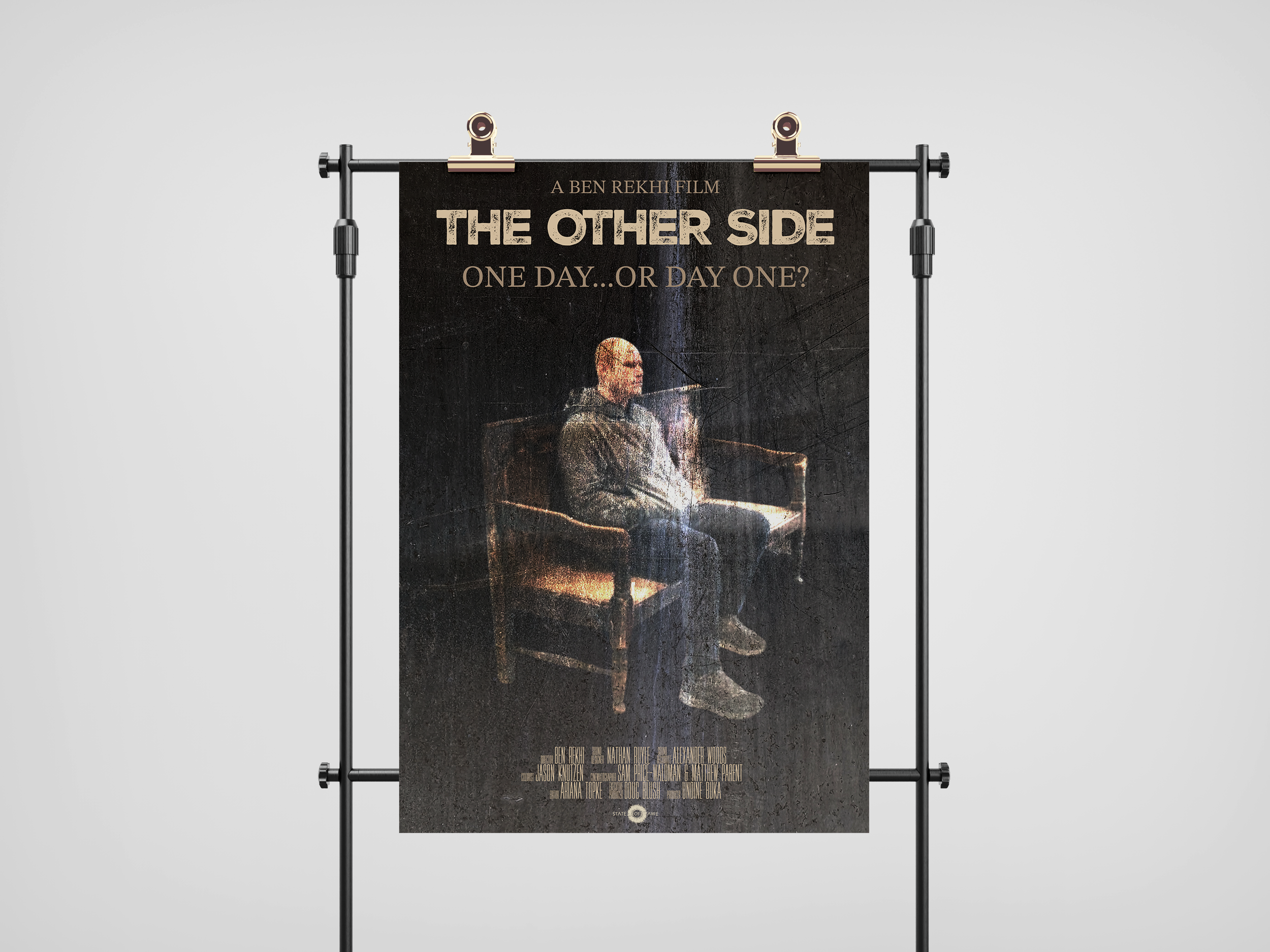
My concept was to depict an element from Zach’s bench scene mostly because I feel like this moment encapsulates the essence and tactical approach of the academy. These people come to the other side of the academy to learn the skills and rewire habits to grow as individuals, changing the trajectory of their lives. This moment where he is sitting on this bench, forced to reflect and dig deep, is so beautiful and, in my opinion, a symbol of the entire film. From an artistic perspective, I wanted to add texture and represent scars abstractly. I personally have a lot of scars on my body from various things, and I think they are so beautiful and show growth and healing. I think the human tendency is to conceal and beautify struggle; I wanted this post to make the viewer stop and feel something. The light stroke represents the light and power that comes from within, and it gets brighter as it hits him in the center. It also creates a subtle division on the poster, which creates two sides [the other side]. The tagline came from the decision to embark on change. That's the hardest part in most cases but the most important. Also, in this scene, he is forced to restart and re-enter the academy, hence the “day one.”
-
In regards to color, warm, deep, and dark tones were what I pursued. The film is gritty and emotionally raw; moody colors best represent that. Color was a huge component of my poster, and tweaking it took the most time in Photoshop. Additionally, that bright white center was an important color choice as it metaphorically shows how the light comes from within, and Zack is making an internal choice at that moment.
-
The hierarchy was essential for this film poster. I wanted the title to be prominent and hold its weight against the central image. Because the poster includes such an intense graphic, I wanted it to read simply and linearly. The type is all centered and spaced in a way that balances the weight of the poster. I played around with different positions of the bench and found it to be strong in the center of the poster; the floating effect brings the composition together beautifully.